Code

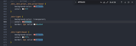
She doesn't seem to be using any variables in her CSS. That could be a problem if she wanted to change any of the colors on her site. In this example, there are 29 instances of the hex code #ff5b50 - changing each one to a new color would be a headache.
User Interface - UI

Veerle is very mindful of the way that different elements look when they are hovered. There are a lot of color changes applied, or in this case, a lack of color.
User Experience - UX

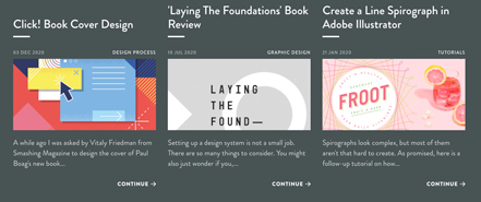
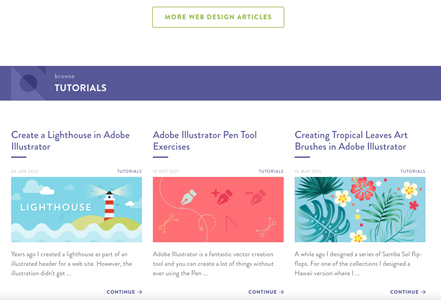
Some of the pages can feel a bit bloated and overloaded with too much information. She has a tutorials page for all of her tutorials, but also adds these same tutorials to an articles page. The articles page is big enough as it is, and I think adding this tutorials section again was unnecessary.
Summary
Veerle is obviously a very skilled web and graphic designer, and her site is an impressive collection of her knowledge and previous work. The purpose of this website is to learn more about her and her design process, subscribe to her newsletter, as well as follow her on her various social medias, which I can do with relative ease.